百变鹏仔-专注前端行业精选


利用css简单实现一个立方体效果 (结构性伪类选择器实现)
作者:鹏仔先生 日期:2020-06-01 16:44:13 浏览:3313 分类:CSS
")
<style type="text/css">
	div,body,input,textarea,a,select,h1,h2,h3,h4,h5,h6,span,p,ul,ol,li,dl,dd,dt,form,table,span,img{
		margin:0;
		padding:0;
	}
	body,html{
		height: 100%;
	}
	.box{
		width: 300px;
		height: 300px;
		position: relative;
		margin: 100px;
		transform: rotateX(30deg) rotateY(-30deg);
		transform-style: preserve-3d;
	}
	.box:after{
		content: ".";
		height: 0;
		clear: both;
		overflow: hidden;
		display: block;
		visibility: hidden;
	}
	.box a{
		text-decoration: none;
		text-align: center;
		line-height: 200px;
		font-size: 35px;
		font-weight: bold;
		color: black;
		position: absolute;
		display: block;
		width: 200px;
		height: 200px;
		background: red;
		opacity: .4;
		transform-style: preserve-3d;
	}
	.box a:nth-child(1){
		background: #fe04ef;
		transform: translateZ(-100px);
	}
	.box a:nth-child(2){
		background: #0497fe;
		transform: translateZ(100px);
	}
	.box a:nth-child(3){
		background: #04fefb;
		transform: rotateY(90deg) translateZ(-100px);
	}
	.box a:nth-child(4){
		background: #fe2d04;
		transform: rotateY(-90deg) translateZ(-100px);
	}
	.box a:nth-child(5){
		background: #effe04;
		transform: rotateX(-90deg) translateZ(-100px);
	}
	.box a:nth-child(6){
		background: #04fe56;
		transform: rotateX(90deg) translateZ(-100px);
	}
</style>
<div class="box"> <a href="#">前</a> <a href="#">后</a> <a href="#">左</a> <a href="#">右</a> <a href="#">上</a> <a href="#">下</a> </div>

- 上一篇:css锚点链接简单实现点击更换内容的方法
- 下一篇:利用css简单实现一个跑马灯效果
猜你还喜欢
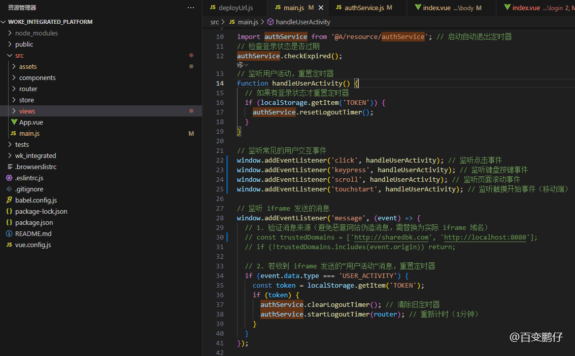
- 09-26 vue中实现1小时不操作则退出登录功能
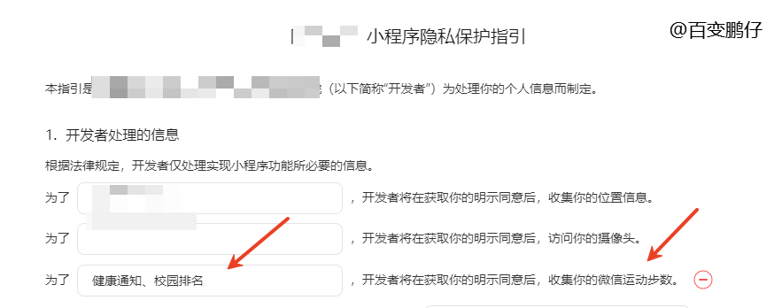
- 05-14 uniapp微信小程序获取微信步数,微信小程序获取微信步数完整版
- 04-24 简单实现文字两端对齐
- 04-24 检测图片URL是否失效
- 04-24 elemetui中el-date-picker限制开始结束日期只能选择当月
- 04-24 iview中DatePicker时间段选择限制开始结束日期只能选择当月
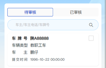
- 03-24 vue h5实现车牌号输入框
- 11-01 vue中实现代码高亮
- 08-09 vue动态修改网站的icon图标
- 07-08 VUE中ECharts提示框tooltip自动切换
- 07-03 网页中生成微信小程序二维码
- 06-28 vue实现表格自动滚动功能 vue-seamless-scroll
取消回复欢迎 你 发表评论:
- 搜索

- 随机tag